Introduction
This is the second part of the U.S. Cities project. In the first part, I created a dataset of metropolitan areas in the United States (called “cities” for simplicity). The dataset contains 14 variables. I will explore the cities data through visualization and testing, and draw some conclusions.
Loading Data
1
2
3
4
5
6
7
# Import libraries used in this project
import pandas as pd
import matplotlib.pyplot as plt
import matplotlib.ticker as mtick
import seaborn as sns
import plotly.express as px
import scikit_posthocs as sp
1
2
3
# Load the US Cities dataset
cities = pd.read_csv('us_cities.csv')
cities.head(10)
| City | State | Region | Size | Population | AvgRent | MedianRent | UnempRate | AvgIncome | CostOfLiving | PriceParity | CommuteTime | MedianAQI | WalkScore | BikeScore | TransitScore | Latitude | Longitude | |
|---|---|---|---|---|---|---|---|---|---|---|---|---|---|---|---|---|---|---|
| 0 | New York | New York | Northeast | Large | 20140470.0 | 3272 | 2323.0 | 3.8 | 85136.0 | 128.0 | 114.58 | 36.7 | 50.0 | 88.0 | 69.3 | 6.9 | 40.6943 | -73.9249 |
| 1 | Los Angeles | California | West | Large | 13200998.0 | 2857 | 1925.0 | 3.9 | 75821.0 | 140.6 | 113.82 | 30.7 | 70.0 | 68.6 | 58.7 | 6.2 | 34.1141 | -118.4068 |
| 2 | Chicago | Illinois | Midwest | Large | 9618502.0 | 1975 | 1364.0 | 4.2 | 71992.0 | 100.1 | 105.42 | 31.8 | 50.0 | 77.2 | 72.2 | 5.1 | 41.8375 | -87.6866 |
| 3 | Dallas | Texas | South | Large | 7637387.0 | 1754 | 1440.0 | 3.2 | 66727.0 | 98.5 | 103.85 | 28.6 | 51.0 | 46.0 | 49.3 | 2.8 | 32.7935 | -96.7667 |
| 4 | Houston | Texas | South | Large | 7122240.0 | 1620 | 1216.0 | 3.9 | 64837.0 | 95.8 | 99.74 | 30.0 | 57.0 | 47.5 | 48.6 | 2.8 | 29.7860 | -95.3885 |
| 5 | Washington | District of Columbia | South | Large | 6385162.0 | 2421 | 1740.0 | 2.8 | 80822.0 | 120.1 | 111.34 | 34.8 | 45.0 | 76.7 | 69.5 | 5.5 | 38.9047 | -77.0163 |
| 6 | Philadelphia | Pennsylvania | Northeast | Large | 6245051.0 | 1663 | 1314.0 | 3.4 | 72379.0 | 103.4 | 99.21 | 29.8 | 48.0 | 74.8 | 66.7 | 5.3 | 40.0077 | -75.1339 |
| 7 | Miami | Florida | South | Large | 6138333.0 | 3201 | 1670.0 | 1.9 | 73522.0 | 110.1 | 109.92 | 29.6 | 45.0 | 76.6 | 64.0 | 5.2 | 25.7840 | -80.2101 |
| 8 | Atlanta | Georgia | South | Large | 6089815.0 | 1991 | 1489.0 | 2.6 | 63219.0 | 100.3 | 99.12 | 32.1 | 48.0 | 47.7 | 41.7 | 2.5 | 33.7628 | -84.4220 |
| 9 | Boston | Massachusetts | Northeast | Large | 4941632.0 | 3419 | 2368.0 | 2.9 | 92290.0 | 132.6 | 109.69 | 31.2 | 44.0 | 82.8 | 69.4 | 5.0 | 42.3188 | -71.0852 |
Now we have all variables of the same data type and all rows with at least half of the values not missing. For the rest of this project, I will cover only a fraction of what can be done, as the possibilities for visualizing this data are endless. I will focus on some of the variables that I found most interesting.
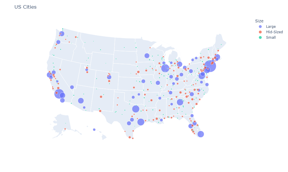
Map
Display our final data on the map with Plotly Express. Note
1
2
3
4
5
6
7
8
9
10
11
12
13
14
15
16
fig = px.scatter_geo(cities,
                    lat='Latitude',
                    lon='Longitude',
                    size='Population',
                    color='Size',
                    hover_data=cities.columns[:13],
                    size_max=30,
                    width=1000,
                    height=600)


fig.update_layout(
    title_text = 'US Cities',
    geo_scope='usa',
)
fig.show()
All Variables Heat Map
First, look at the correlation between all variables in the data set with a heat map.
1
2
3
4
5
6
7
8
9
# Full names of variables for better readability
columns_full_names = ['Population', 'Average Rent', 'Median Rent', 'Unemployment Rate', 'Average Income',
                      'Cost of Living', 'Price Parity', 'Commute Time', 'Median AQI', 'Walk Score', 'Bike Score', 'Transit Score']

# Set theme for all the future graphs
sns.set_theme(style="white", rc={'figure.figsize':(9,6)})

sns.heatmap(cities.corr(), cmap="coolwarm", annot=True, vmin=-1, vmax=1, annot_kws={"size": 9}, xticklabels=columns_full_names, yticklabels=columns_full_names)
plt.show()
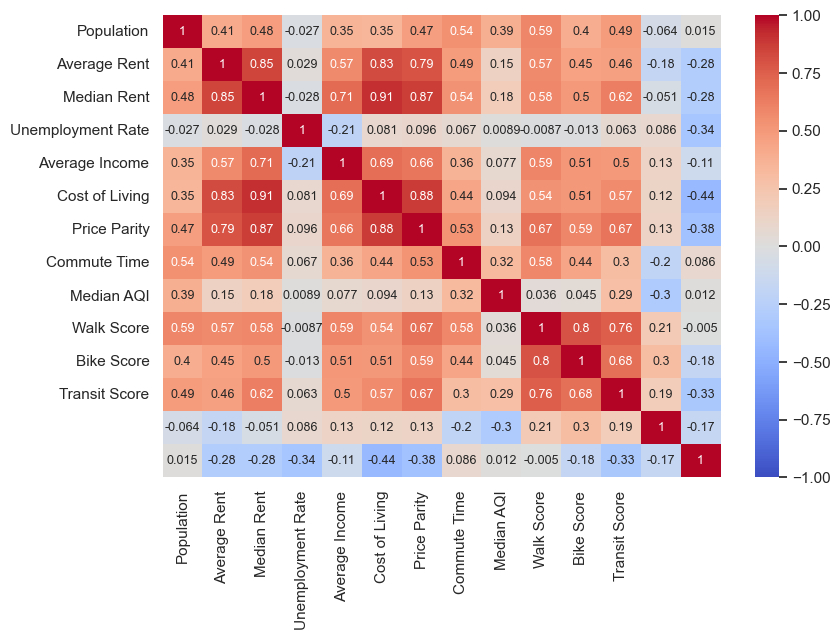
From this map, we can see that:
- There are a number of fairly obvious observations. High cost of living is accompanied by high rental prices and high incomes (and vice versa). It makes sense since rental prices contribute a lot to cost of living. Also, cities with good walkability are good at public transportation and bike construction.
- Another obvious observation is that cities with large populations are, on average, more expensive, have higher incomes, and have worse air quality.
- A correlation between air quality (note that this is the only metric where the higher means the worse) and commute time can indicate either that air quality is affected by traffic congestion and transportation emissions, or that both parameters are caused by high population.
- The unemployment rate has a near-zero correlation with all other variables. However, the only significant correlation is with average income, meaning that higher unemployment rates tend to be associated with lower average incomes.
- The median rent has a stronger correlation with other factors than the average rent, meaning it could be a more important factor in determining a city’s livability.
Summary Statistics by Size
Use the df.describe() method to get summary statistics about the DataFrame. But to better understand the situation, it’s better to divide our table into three by metropolitan area size.
1
2
3
# Summary statistics for large cities
large_cities = cities.loc[cities.Size == 'Large']
large_cities.describe()
| Population | AvgRent | MedianRent | UnempRate | AvgIncome | CostOfLiving | PriceParity | CommuteTime | MedianAQI | WalkScore | BikeScore | TransitScore | Latitude | Longitude | |
|---|---|---|---|---|---|---|---|---|---|---|---|---|---|---|
| count | 5.600000e+01 | 56.000000 | 56.000000 | 55.000000 | 56.00000 | 55.000000 | 56.000000 | 56.000000 | 56.000000 | 51.000000 | 51.000000 | 56.000000 | 56.000000 | 56.000000 |
| mean | 3.377466e+06 | 1833.964286 | 1376.803571 | 3.040000 | 67278.37500 | 105.452727 | 100.760893 | 26.883929 | 48.321429 | 52.929412 | 54.570588 | 3.801786 | 36.992770 | -93.794825 |
| std | 3.296962e+06 | 608.939554 | 467.829472 | 0.783771 | 15070.67341 | 18.644450 | 7.328437 | 3.494764 | 9.309052 | 16.642335 | 12.757355 | 1.514475 | 5.281255 | 18.151173 |
| min | 1.008654e+06 | 1130.000000 | 830.000000 | 1.900000 | 50384.00000 | 86.700000 | 90.620000 | 21.200000 | 29.000000 | 25.600000 | 30.700000 | 0.100000 | 21.329400 | -157.846000 |
| 25% | 1.394931e+06 | 1382.000000 | 1020.500000 | 2.550000 | 58955.25000 | 93.450000 | 95.435000 | 24.475000 | 44.000000 | 41.150000 | 43.900000 | 2.600000 | 33.715150 | -106.376525 |
| 50% | 2.274416e+06 | 1717.000000 | 1287.500000 | 2.900000 | 64239.00000 | 100.100000 | 98.850000 | 26.450000 | 46.000000 | 49.500000 | 54.000000 | 3.600000 | 37.642650 | -87.241850 |
| 75% | 4.112082e+06 | 1979.000000 | 1533.750000 | 3.400000 | 70710.50000 | 108.550000 | 105.382500 | 29.000000 | 51.000000 | 65.700000 | 64.850000 | 5.025000 | 40.715125 | -80.675250 |
| max | 2.014047e+07 | 3422.000000 | 3000.000000 | 6.200000 | 136338.00000 | 178.600000 | 119.830000 | 36.700000 | 84.000000 | 88.700000 | 83.500000 | 6.900000 | 47.621100 | -71.085200 |
1
2
3
# Summary statistics for mid-sized cities
mid_cities = cities.loc[cities.Size == 'Mid-Sized']
mid_cities.describe()
| Population | AvgRent | MedianRent | UnempRate | AvgIncome | CostOfLiving | PriceParity | CommuteTime | MedianAQI | WalkScore | BikeScore | TransitScore | Latitude | Longitude | |
|---|---|---|---|---|---|---|---|---|---|---|---|---|---|---|
| count | 129.000000 | 129.000000 | 129.000000 | 125.000000 | 129.000000 | 122.000000 | 129.000000 | 126.000000 | 129.000000 | 23.000000 | 23.000000 | 129.000000 | 129.000000 | 129.000000 |
| mean | 503160.472868 | 1521.248062 | 1068.031008 | 3.446400 | 57256.813953 | 97.607377 | 95.566589 | 23.334921 | 41.193798 | 38.365217 | 45.047826 | 2.334884 | 37.386640 | -92.338268 |
| std | 206013.220412 | 479.419620 | 342.103236 | 1.329294 | 12252.266043 | 13.052837 | 5.534128 | 2.894141 | 6.788176 | 7.553904 | 8.968828 | 1.124490 | 5.666978 | 16.017321 |
| min | 256728.000000 | 781.000000 | 663.000000 | 1.600000 | 34503.000000 | 83.900000 | 85.880000 | 17.300000 | 18.000000 | 21.400000 | 29.700000 | 0.400000 | 25.997500 | -149.109100 |
| 25% | 328883.000000 | 1217.000000 | 854.000000 | 2.500000 | 50616.000000 | 88.625000 | 91.870000 | 21.425000 | 39.000000 | 33.250000 | 40.300000 | 1.500000 | 33.364500 | -98.246700 |
| 50% | 433353.000000 | 1420.000000 | 959.000000 | 3.100000 | 54623.000000 | 93.250000 | 93.960000 | 22.900000 | 42.000000 | 39.100000 | 43.700000 | 2.100000 | 37.689500 | -87.191100 |
| 75% | 649903.000000 | 1784.000000 | 1188.000000 | 3.900000 | 61547.000000 | 102.075000 | 98.960000 | 24.800000 | 44.000000 | 43.900000 | 51.900000 | 3.000000 | 41.311300 | -81.322300 |
| max | 978529.000000 | 3350.000000 | 2602.000000 | 8.800000 | 127391.000000 | 163.900000 | 111.810000 | 33.300000 | 67.000000 | 49.700000 | 65.500000 | 5.100000 | 61.150800 | -70.271500 |
1
2
3
# Summary statistics for small cities
small_cities = cities.loc[cities.Size == 'Small']
small_cities.describe()
| Population | AvgRent | MedianRent | UnempRate | AvgIncome | CostOfLiving | PriceParity | CommuteTime | MedianAQI | WalkScore | BikeScore | TransitScore | Latitude | Longitude | |
|---|---|---|---|---|---|---|---|---|---|---|---|---|---|---|
| count | 159.000000 | 159.000000 | 153.000000 | 155.000000 | 159.000000 | 158.000000 | 158.000000 | 107.00000 | 117.000000 | 0.0 | 0.0 | 159.000000 | 159.000000 | 159.000000 |
| mean | 152830.031447 | 1350.805031 | 903.183007 | 3.329032 | 53693.761006 | 93.772785 | 92.706582 | 21.31215 | 37.324786 | NaN | NaN | 1.508805 | 38.796727 | -93.214609 |
| std | 44979.209688 | 405.689107 | 192.709334 | 1.368807 | 9761.348362 | 8.804079 | 4.695104 | 3.61012 | 8.521604 | NaN | NaN | 1.104042 | 5.438363 | 14.843885 |
| min | 58639.000000 | 657.000000 | 648.000000 | 1.700000 | 41012.000000 | 82.600000 | 85.480000 | 15.70000 | 10.000000 | NaN | NaN | 0.000000 | 26.894100 | -147.653300 |
| 25% | 121836.500000 | 1057.000000 | 772.000000 | 2.400000 | 47868.000000 | 88.025000 | 89.232500 | 19.00000 | 36.000000 | NaN | NaN | 0.700000 | 34.673200 | -100.609900 |
| 50% | 150309.000000 | 1293.000000 | 852.000000 | 3.100000 | 51965.000000 | 91.050000 | 92.025000 | 20.70000 | 39.000000 | NaN | NaN | 1.400000 | 39.188600 | -88.970300 |
| 75% | 181630.000000 | 1590.000000 | 1011.000000 | 3.850000 | 56899.000000 | 97.275000 | 94.875000 | 23.45000 | 42.000000 | NaN | NaN | 2.300000 | 42.471750 | -82.215950 |
| max | 249843.000000 | 2898.000000 | 1959.000000 | 13.700000 | 125455.000000 | 149.600000 | 112.070000 | 39.40000 | 67.000000 | NaN | NaN | 4.700000 | 64.835300 | -68.790600 |
From tables above, we can see that regional price parity in cities with population more than one million is almost equal to the national average of 100. Meanwhile, living cost in mid-sized and small cities is 95.6% and 92.7% of the U.S. average.
Just as we saw on the heat map, larger cities have worse air quality and longer commutes, but have higher incomes and better transportation.
Commute Time vs Transit Score by Size
The heatmap shows some correlation (0.3) between the median commute time and the transit score. It doesn’t necessarily means that the better the public transportation in a city, the longer it takes to get to work, but this correlation seems counterintuitive. Let’s explore it further by plotting it and using the price parity and size as third and forth variables.
The most likely explanation is that both longer commutes and good public transportation are attributes of large cities with high costs of living.
1
2
3
4
5
6
7
palette = sns.color_palette("coolwarm", as_cmap=True)
sns.scatterplot(data=cities, x='CommuteTime', y='TransitScore', hue='PriceParity', palette=palette,
                size='Size', size_order=['Large', 'Mid-Sized', 'Small'], sizes=[80, 40, 20])
plt.title('Median Commute Time vs Transit Score', fontsize=16)
plt.xlabel('Median Travel Time to Work')
plt.ylabel('Transit Score')
plt.show()
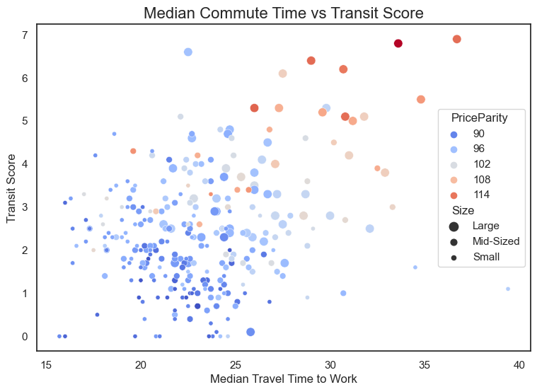
The larger and more expensive cities occupy the upper right corner of the graph, while smaller and cheaper cities are associated with poorer public transportation and shorter commutes.
Average Income and Rent by Size and Region
1
2
3
4
5
6
7
ax = sns.scatterplot(data=cities, x='AvgIncome', y='AvgRent', hue='Region',
                size='Size', size_order=['Large', 'Mid-Sized', 'Small'], sizes=[80, 40, 20])
ax.set_xlim(left=25000)
plt.title('Average Incomes vs Average Rental Prices', fontsize=16)
plt.xlabel('Average Income')
plt.ylabel('Average Rental Price')
plt.show()

From the graph, we can see that the South has lower incomes than the Midwest (with a number of outliers), but more expensive rents. The western cities have higher rents, but also higher incomes. Let’s run the Tukey’s test to see if the average incomes and rental prices are significantly different between the US regions.
- A value of 0 indicates that there is no significant difference in average income between the corresponding regions.
- A value of 1 indicates that there is a significant difference in average income between the corresponding regions.
1
2
# Differences in the means of average incomes
sp.posthoc_tukey_hsd(x=cities.AvgIncome, g=cities.Region)
| Midwest | Northeast | South | West | |
|---|---|---|---|---|
| Midwest | 1 | 1 | 0 | 0 |
| Northeast | 1 | 1 | 1 | 0 |
| South | 0 | 1 | 1 | 1 |
| West | 0 | 0 | 1 | 1 |
The table shows some interesting results. There’s no significant difference in average incomes in the Midwest-South and Midwest-West pairs, but there is a difference in West-South. The Northeast and South incomes are the most “different” from the rest of the group. From the scatterplot, we can conclude that the Northeast has the highest, while the South has the lowest. The Western cities are second in terms of income, and the Midwest is third.
Let’s check this assumption by looking at the actual means.
1
2
3
4
# Income means across regions
region_list = ['Midwest', 'Northeast', 'South', 'West']
for region in region_list:
    print(f"Average income in {region} is {cities[cities['Region'] == region]['AvgIncome'].mean()}")
1
2
3
4
Average income in Midwest is 56058.39759036145
Average income in Northeast is 62188.065217391304
Average income in South is 54122.794117647056
Average income in West is 60972.50632911392
1
2
# Differences in means of average rental prices
sp.posthoc_tukey_hsd(x=cities.AvgRent, g=cities.Region)
| Midwest | Northeast | South | West | |
|---|---|---|---|---|
| Midwest | 1 | 1 | 1 | 1 |
| Northeast | 1 | 1 | 0 | 1 |
| South | 1 | 0 | 1 | 1 |
| West | 1 | 1 | 1 | 1 |
1
2
for region in ['Midwest', 'Northeast', 'South', 'West']:
    print(f"Average rental in {region} is {cities[cities['Region'] == region]['AvgRent'].mean()}")
1
2
3
4
Average rental in Midwest is 1135.3975903614457
Average rental in Northeast is 1548.5652173913043
Average rental in South is 1476.2426470588234
Average rental in West is 1866.8354430379748
The only pair with no significant difference is Northeast-South. From these two tables and the scatterplot, we can see that a region with the highest rents is not the region with the highest incomes, and the region with the lowest rents is not the region with the lowest incomes. This could be explained by outliers in one of these two variables (for example, a city in the West with very high rents but moderate incomes).
Median Rental Prices by Region and Size
Explore the rental prices by region further with regard to the size.
1
2
3
4
5
6
7
8
9
10
11
12
13
14
15
16
17
18
19
20
21
22
23
fig, axes = plt.subplots(1, 4, figsize=(16, 6))

sns.set_palette("Set3")
ax1, ax2, ax3, ax4 = axes
ylim = (600, 2800)
fontsize = 12

for ax, region in zip(axes, region_list):
    sns.boxplot(y='MedianRent', x='Size', data=cities[cities['Region'] == region], ax=ax,
                showfliers=False, palette="Set3")

    ax.set_ylim(ylim)
    ax.set_title(f"Median Rental Price in {region}", fontsize=fontsize)
    ax.xaxis.set_label_position('top')
    ax.set_xlabel('')
    ax.set_ylabel('')

    # Adjust tick label font size and add grid lines
    ax.tick_params(axis='both', which='major', labelsize=fontsize)
    ax.grid(True, linestyle='--', axis='y')

plt.tight_layout()
plt.show()
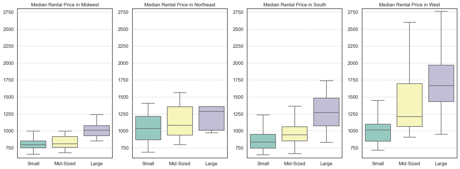
Large cities are more expensive to rent, but there are important differences between regions. For example, large cities in the Midwest are still cheaper than small cities in the Northeast. Midsize Western cities can be as expensive or more than large Southern and Northeastern cities.
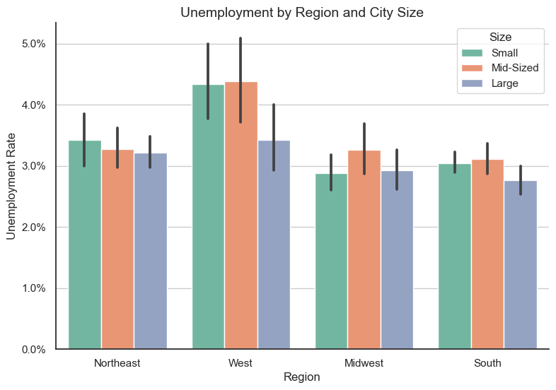
Unemployment Rate by Region and Size
Cities in the West have the highest unemployment rate, while the Northeast is the only region where small cities have a higher unemployment rate than medium-sized cities.
1
2
3
4
5
6
7
8
9
10
11
12
13
14
15
fig, ax = plt.subplots()
sns.set_palette("Set2")

with sns.axes_style("whitegrid"):
    sns.barplot(y='UnempRate', x='Region', hue='Size', data=cities)
    ax.set_ylabel('Unemployment Rate')

    # To show percetage
    ax.yaxis.set_major_formatter(mtick.PercentFormatter())
    ax.spines['top'].set_visible(False)
    ax.spines['right'].set_visible(False)
    ax.grid(True, linestyle='-', axis='y')

plt.title('Unemployment by Region and City Size', fontsize=14)
plt.show()
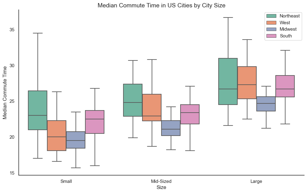
Commute Times by Region and Size
The bigger a city, the longer it takes to get to work. But there are some differences between regions.
1
2
3
4
5
6
7
8
9
10
11
12
fig, ax = plt.subplots(figsize=(12, 7))

sns.boxplot(y='CommuteTime', x='Size', hue='Region', data=cities, showfliers=False, ax=ax)

ax.set_ylabel('Median Commute Time')
ax.set_title('Median Commute Time in US Cities by City Size', fontsize=14)

ax.legend(loc='upper right')
ax.spines['top'].set_visible(False)
ax.spines['right'].set_visible(False)

plt.show()
Median AQI by Size
1
2
3
4
5
6
7
8
9
10
11
12
13
14
15
fig, ax = plt.subplots(figsize=(8, 6))
sns.set_palette("Set1")

sns.kdeplot(data=small_cities['MedianAQI'], shade=True, label='Small Cities')
sns.kdeplot(data=mid_cities['MedianAQI'], shade=True, label='Mid-Sized Cities')
sns.kdeplot(data=large_cities['MedianAQI'], shade=True, label='Large Cities')

plt.xlabel('Air Quality Index')
plt.ylabel('')
ax.spines['top'].set_visible(False)
ax.spines['right'].set_visible(False)
plt.title('Air Quality in United States Cities by City Size')
plt.legend()

plt.show()

Obviously, the smaller the city, the cleaner the air. The index from 0 to 50 is considered good, from 51 to 100 – moderate. In the long run, there is no city with unhealthy air. Still, some large cities are in the upper half of what is considered moderate. No large city has an AQI below 20, which makes sense since “large cities” in the US are really large.
1
cities[cities['MedianAQI'] >= 75][['City', 'Population', 'MedianAQI']]
| City | Population | MedianAQI | |
|---|---|---|---|
| 10 | Phoenix | 4845832.0 | 77.0 |
| 12 | Riverside | 4599839.0 | 84.0 |
Conclusion
After collecting and cleaning the data, I used exploratory data analysis. There are many ways to explore this data, and I chose to do the following:
- Map of cities by size with all variable information in the toolkit;
- Heatmap to see the correlation between all variables and summary statistics tables;
- Scatterplot of correlation between commute times and transit score (by size);
- Scatterplot of correlation between average incomes and rents (by size and region);
- Boxplot of median rental prices (by region and size);
- Bar chart of unemployment rates (by region and size);
- Box plot of commute times (by region and size);
- Distribution plot of median air quality index (by size).
Some of the things we found during the analysis:
- The median rental price can be a better predictor of a city’s livability than the average rental price – because it has a stronger correlation with other variables;
- The data confirms all the chronic problems of metro areas with large populations: poor air quality, longer commutes, high cost of living. But they have better public transportation and are more pedestrian friendly;
- Rents in the South are not significantly lower than in the Northeast, but incomes are much lower. Conversely, the Midwest has the same incomes as the South, but rents are much lower.
- Despite lower incomes, cities in the Midwest and South have lower unemployment rates;
- The Midwest also has the shortest commute times of any size category.